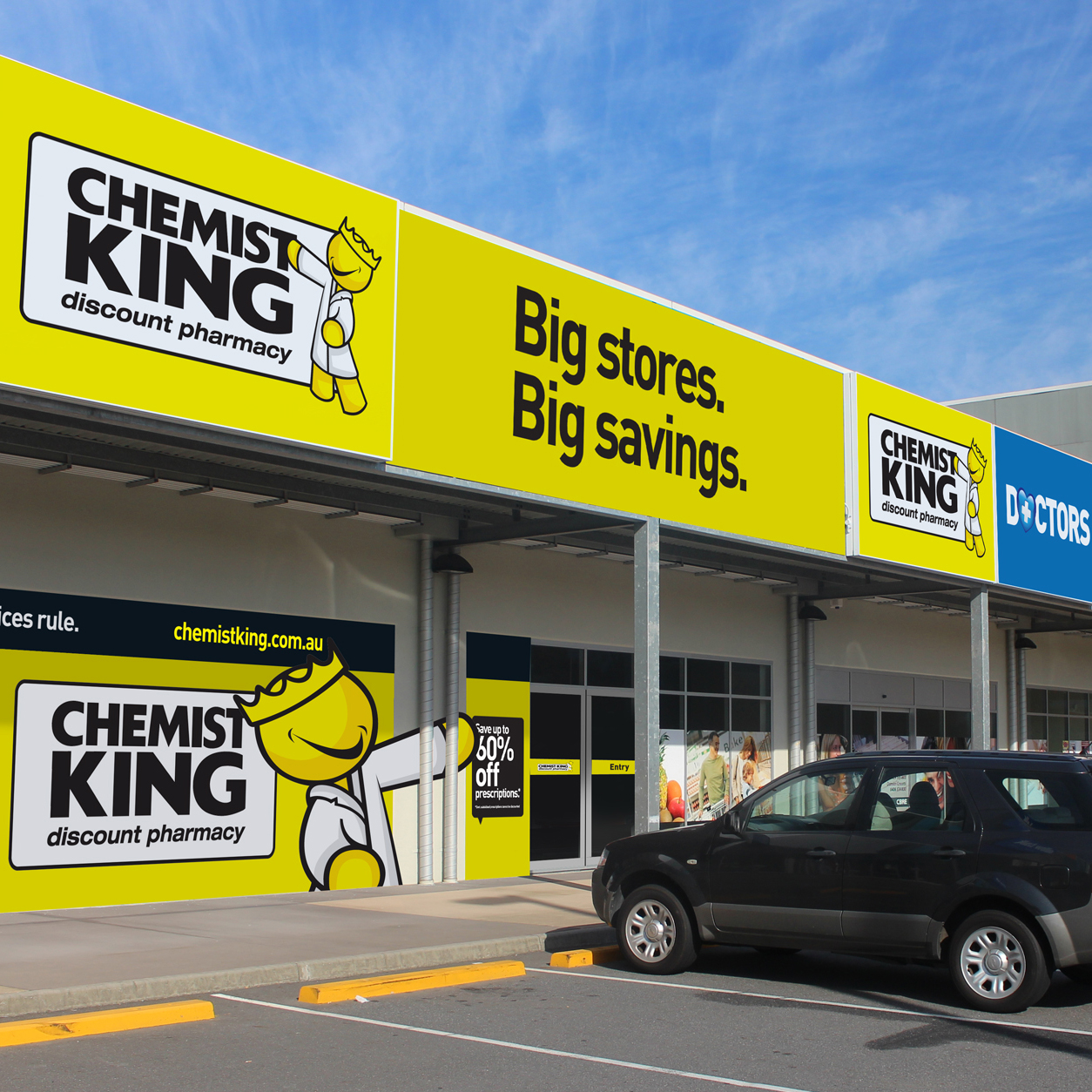
Revolutionising the corporate brand of our esteemed chemist, we embarked on a transformative journey to imbue it with boldness, edginess, and effortless recognition. The new design ethos abandons unnecessary complexities, embracing a minimalist approach that exudes confidence and clarity. A sleek, monochromatic palette lends sophistication, while sharp, angular typography reinforces a sense of modernity. A distinct icon, perhaps an abstract representation of a chemical compound, serves as the focal point—immediately recognizable and synonymous with our commitment to cutting-edge pharmaceuticals. The brand now radiates a no-nonsense vibe, capturing attention with its daring simplicity. This redesign not only communicates a progressive identity but also establishes our chemist as a confident, forward-thinking player in the industry, making a lasting impression on clients and competitors alike.