Cloudatmo concept
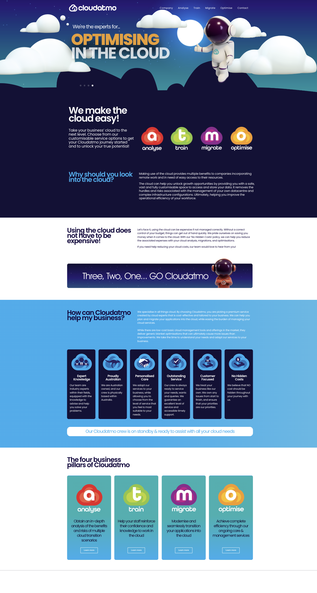
In the crowded landscape of cloud technology, Cloudatmo, a small Brisbane-based company, sought to carve its distinct niche. Despite possessing significant expertise, the challenge lay in overcoming a lack of consumer awareness and recognition amid industry giants. The solution? Enter ‘ATMO,’ a carefully crafted caricature designed to be the face of Cloudatmo – a unique and relatable corporate symbol.
ATMO transcended being just a logo; it became the embodiment of Cloudatmo’s identity. With a playful and approachable demeanour, ATMO offered consumers a recognizable and friendly connection to the brand. This caricature cut through the noise of larger competitors, providing a visual anchor for consumer engagement.
As the regular and recognisable corporate symbol of Cloudatmo, ATMO not only differentiated the brand but also cultivated a sense of familiarity and trust. The character became a visual shorthand for the company’s values, fostering a connection that elevated Cloudatmo from the background to a prominent and memorable player in the competitive realm of cloud technology.
Client
Cloudatmo


